
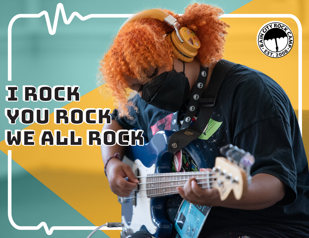
Rain City Rock Camp
Role: Design, Board Co-Chair
Date: 2016-present
Type: Music camp for people marginalized by gender
Location: Seattle, WA
Applications: Adobe Illustrator, Adobe Photoshop, Adobe InDesign, Canva
Benefit Concert Program
Applications: Canva, Adobe Photoshop


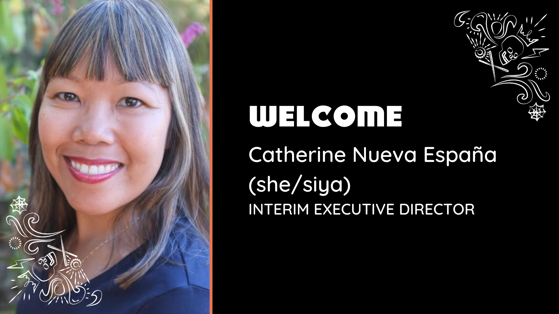
Galaween
I created a visual theme for and made a variety of materials for the 2024 Gala with a Halloween theme.
Application: Canva, Adobe Illustrator
Program


Social Media


slide Deck


Cards and Postcards
Applications: Adobe InDesign, Adobe Illustrator, Adobe Photoshop, Canva


album art
For summer camp 2020-2021, designers created album art for camper bands using descriptions and inspiration from the campers. These artworks were all done in one evening and were extremely fun to work on.
Applications: Adobe Illustrator, Adobe Photoshop